I am sitting here and wondering why I never had the courage to learn Flexbox a long time ago. I have been using CSS for over three years now, and honestly, it’s always the worst part of my projects. Recently, I came across a Flexbox article and decided to go over it. After two minutes of reading, I knew that I had found the “messiah of the CSS nation”.
This article will cover the various Flexbox properties, and how you can use them in your web projects. Flexbox makes responsive design easier.
What is Flexbox?
The Flexible Box Module, usually referred to as flexbox, was designed as a one-dimensional layout model, and as a method that could offer space distribution between items in an interface and powerful alignment capabilities.
According to MDN, Flexbox enables you to easily layout an HTML document. This is by providing properties that permit you to align elements in your document and share the space among these elements.
Before we dive into the fundamental Flexbox properties, it is important to understand these following terminology as you observe the diagram below:
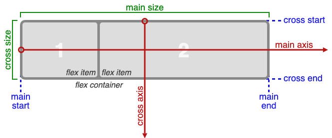
- Flexbox is a one-dimensional layout model: This means that Flexbox handles the layout either horizontally OR vertically. That is to say, one dimension at a time. From the diagram above, Flexbox is dealing with the layout horizontally. This is because the main axis is horizontal as the flex items are in a row. Don’t worry, this will become clear when we look at the flex-direction property.
- The two axes of Flexbox: The two dimensions described in 1 above, are represented by the Main Axis and the Cross Axis. Main Axis: The main axis is the primary axis along which flex items are laid. Cross Axis: The cross axis is perpendicular to the main axis.
- Flex Container: This is the area of the document which is laid out using flexbox.
- Flex items: These are the direct children of a flex container. From the diagram above, we can observe that the boxes 1 and 2 are flex items inside the flex container.
- Main size: This is the width of the flex container when the main axis is horizontal, as shown in the diagram above. It is also the height of the flex container if the main axis is vertical.
- Cross size: This is the height of the flex container when the main axis is horizontal. For instance, as in the diagram above. Also, it is the width of the flex container when the main axis is vertical.
- Main start and Main end: According to W3C official documentation, the flex items are placed within the container starting on the main-start side and going toward the main-end side.
- Cross start and Cross end: Flex lines are filled with items and placed into the container starting on the cross-start side of the flex container and going toward the cross-end side.
Now let us look at some Flexbox properties. These properties are used on the flex container for the most part.
7 most common Flexbox properties.
This section contains code snippets, and images that how each will display in the browser. We will see how some options for each property change the display. However, we will leave out some other properties for you to try on your own.
Create a project folder on your local machine, and name it “flexbox_basics”. Create two files in that project folder: index.html and style.css. The project structure should be as shown below:

We will be using the HTML below (index.html) to illustrate how the various properties work.
<!DOCTYPE html>
<html lang=”en”>
<head>
<meta charset=”UTF-8">
<title>Flexbox Beginner’s guide</title>
<link rel=”stylesheet” href=”style.css”>
</head>
<body>
<div class=”container”>
<div class=”item item1">Item 1</div>
<div class=”item item2">Item 2</div>
<div class=”item item3">Item 3</div>
<div class=”item item4">Item 4</div>
<div class=”item item5">Item 5</div>
<div class=”item item6">Item 6</div>
</div>
</body>
</html>
Now, we will give the items (items 1– 6) some background colors in style.css file so that we can easily observe the changes. This is what the style.css file looks like before we start adding flexbox properties.
.container {
border: 10px solid goldenrod;
}
.item {
height: 50px;
font-size: 30px;
text-align: center;
padding: 20px 10px 20px 10px ;
}
.item1 { background-color: greenyellow; }
.item2 { background-color: gold; }
.item3 { background-color: blueviolet; }
.item4 { background-color: salmon; }
.item5 { background-color: violet; }
.item6 { background-color: darkred; }
Feel free to copy and paste these code snippets into the files. However, it is important to understand what each line of the code does.
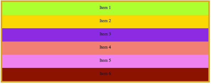
So if you open the index.html file in the browser you should see something like this:
Property #1: display: flex | display: inline-flex
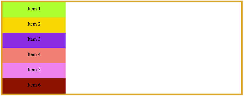
This is the first property that has to be set in order to use Flexbox. From figure 3 above, the container has 6 items. We have given the container a border of 10px solid goldenrod. To make the .container element a Flex container, we add the display: flex property to this element.
The new style for the .container element should be like this:
.container {
display: flex;
border: 10px solid goldenrod;
}
We are telling the browser, that “hey browser, I want you to know that the .container element is a Flexbox element”. You should observe the following change in the browser.

Also, the display can take inline-flex as an option.
.container {
display: inline-flex;
border: 10px solid goldenrod;
}
If you change display: flex to display: inline-flex, you will observe the following in the browser.

Observe the difference between the flex and inline-flex options. The display: flex property says, “hey, browser, let the flex container take up the whole width of the display screen”. On the other hand, the display: inline-flex property says, “hey, browser, let the flex container take up only as much the width of all the flex-items combined, and no more!”
It is recommended to place display: flex as the first property for the flex container.
You will understand why the elements have changed direction (from vertical to horizontal) when we look at the flex-direction property.
Property #2: flex-direction
Recall the definition of the main and cross axes. The flex-direction property tells the browser which direction the flex-items should follow. The flex-direction property can take four options: row | row-reverse | column | column-reverse. However, when we add display: flex to the .container, then the flex-direction is set to row by default.
For instance, let us add the flex-direction: row property to the .container element. You will observe, that nothing changes.
.container {
display: flex;
flex-direction: row;
border: 10px solid goldenrod;
}
Now, we can see below that there is no change in the browser.

The flex-direction property determines the direction of the main axis. By default, the main axis runs horizontally. This explains why all the elements are aligned horizontally when we add the display: flex property to the flex container. Specifying that flex-direction: row does not change anything because that is already the default.
Now let us see what will happen when we change the flex-direction to the column using the flex-direction: column property.
.container {
display: flex;
flex-direction: column;
border: 10px solid goldenrod;
}
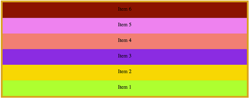
Observe the change in the browser, as shown in the diagram below.

Don’t be tempted to think that the flex items have been aligned along the cross axis. This is not the case. The flex-direction: column property simply says, “hey browser, I want the main axis to run vertically”. This explains why the flex items run vertically.
You can also the flex-direction property to
flex-direction: row-reverse;

OR
flex-direction: column-reverse;
Property #3: flex-wrap
Flexbox tries to fit all the items in one row by default. However, you can alter this behaviour by using the flex-wrap property. The flex-wrap property can take three options: flex-wrap: nowrap, flex-wrap: wrap, flex-wrap: wrap-reverse. We will make each flex item to have a width of 25% of the screen. This will enable to appreciate the effects of the flex-wrap options.
Enough talk! Now, let us see how these flex-wrap properties will affect our HTML document. Let us begin with the nowrap option. What do you think will happen to the flex items?
.container {
display: flex;
flex-direction: row;
flex-wrap: nowrap;
border: 10px solid goldenrod;
}
.item {
width: 25%;
height: 50px;
font-size: 30px;
text-align: center;
padding: 20px 10px 20px 10px ;
}
This is what you will see in the browser.

It is obvious, nothing changes, from the name “ No wrap”. You can change the flex-direction to flex-direction: column and observe if there’s any change. Even if we increase the width of the flex items to width: 50% each, they will still shrink to fit within the flex container on the same row. Try this out.
Secondly, let us explore the wrap property. Make the following change in the code.
.container {
display: flex;
flex-direction: row;
flex-wrap: wrap;
border: 10px solid goldenrod;
}
.item {
width: 25%;
height: 50px;
font-size: 30px;
text-align: center;
padding: 20px 10px 20px 10px ;
}
Check your browser, and make sure you have the following display.

The flex items are wrapped inside the container following their individual width. When there is not enough space for an item to fit in a row, then it moves (wraps) down to the next line.
You can change the width of the flex items and observe how the display changes.
Lastly, let us see how the wrap-reverse property works.
.container {
display: flex;
flex-direction: row;
flex-wrap: wrap-reverse;
border: 10px solid goldenrod;
}
.item {
width: 25%;
height: 50px;
font-size: 30px;
text-align: center;
padding: 20px 10px 20px 10px ;
}
Then in the browser, we can observe the following.

Change the width of the flex items to width: 20%, and width: 60% and observe the wrap and wrap-reverse options work.
Also, you can combine flex-direction: column | column-reverse | row | row-reverse with flex-wrap: wrap | wrap-reverse | nowrap and the observe the display the browser.
Property #4: flex-flow
The flex-flow property is a combination of the flex-direction and flex-wrap into one property. The flex-flow property takes two options at a time, that is the flex-direction and the flex-wrap options. For instance, instead of doing
.container {
flex-direction: column;
flex-wrap: wrap;
}
we can do
.container {
flex-flow: column wrap;
}
So from the HTML document we have, change the style.css file to have the following code lines in bold.
.container {
display: flex;
flex-flow: column wrap;
border: 10px solid goldenrod;
}
.item {
width: 25%;
height: 50px;
font-size: 30px;
text-align: center;
padding: 20px 10px 20px 10px ;
}
This is what you’ll observe in the browser.
Similarly, if we do flex-direction: row; and flex-wrap: wrap; then we will observe that it is similar to doing flex-flow: row wrap;
.container {
display: flex;
flex-flow: row wrap;
border: 10px solid goldenrod;
}
.item {
width: 25%;
height: 50px;
font-size: 30px;
text-align: center;
padding: 20px 10px 20px 10px ;
}
This will give us the following display in the browser.

Property #5: justify-content
The justify-content property aligns flex items along the main axis in the container. It enables us to define how we want the space around the items to be shared.
Justify-content makes use of the extra space on the main axis.
The justify-content property can take options like flex-start | center | flex-end | space-between | space-around.
We will give the flex container a background to observe the effects of each option. Follow the changes made to the code, and see the corresponding as shown below:
justify-content: flex-start
.container {
display: flex;
justify-content: flex-start;
border: 10px solid goldenrod;
background-color: lightgrey;
}
.item {
height: 50px;
font-size: 30px;
text-align: center;
padding: 20px 10px 20px 10px ;
}

justify-content: flex-end
.container {
display: flex;
justify-content: flex-end;
border: 10px solid goldenrod;
background-color: lightgrey;
}

justify-content: center
.container {
display: flex;
justify-content: center;
border: 10px solid goldenrod;
background-color: lightgrey;
}

justify-content: space-around
.container {
display: flex;
justify-content: space-around;
border: 10px solid goldenrod;
background-color: lightgrey;
}

justify-content: space-between
.container {
display: flex;
justify-content: space-between;
border: 10px solid goldenrod;
background-color: lightgrey;
}

Let us discuss, the space-around and space-between options.
Firstly, the space-around option distributes the flex items such that the space between each item is 2 times the space between the flex container and the first item, and the space between the flex container and the last item.
Secondly, the space-between option gives equal spacing between all the flex items, and there is no space between the flex container and the first and last flex items.
Property #6: align-items
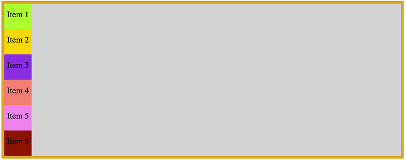
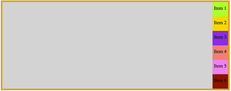
The align-items property controls how flex items are aligned along the cross axis. Therefore, justify-content is to the main axis as align-items is to cross axis.
The align-items property takes the following options: align-items: flex-start | center | flex-end | space-around | space-between.
Let us observe how the various options affect the alignment of the flex items in the container.
align-items: flex-start
.container {
display: flex;
align-items: flex-start;
border: 10px solid goldenrod;
background-color: lightgrey;
}

align-items: flex-end and align-items: cethe nter will show the same thing as in Figure 20 above. However, intoppreciate the effect of the align-item property, we have to change flex-direction: column.
Now let us revisit the align-items: flex-start property with flex-direction: column.
align-items: flex-start
.container {
display: flex;
flex-direction: column;
align-items: flex-start;
border: 10px solid goldenrod;
background-color: lightgrey;
}

Property #7: align-content
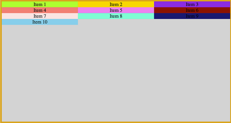
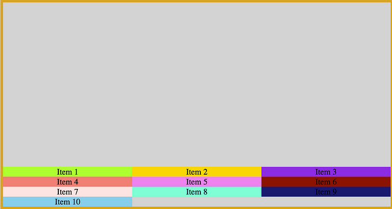
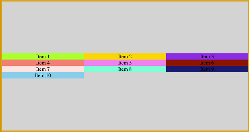
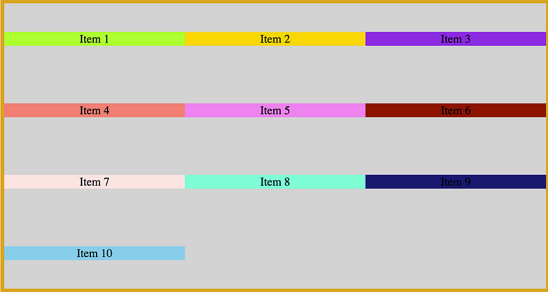
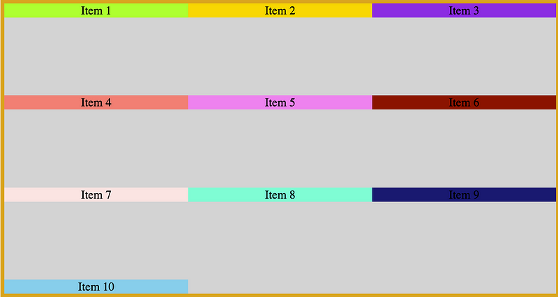
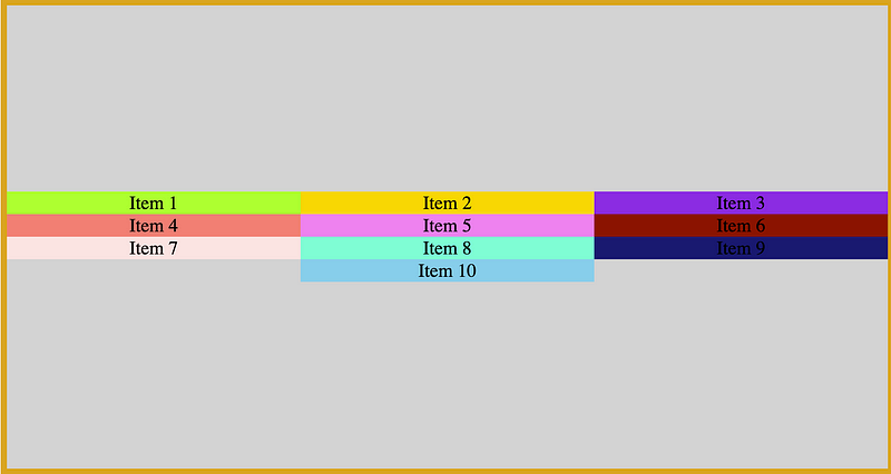
The align-content property is used to align items with multiple lines on the cross axis. As a result, it will not have any effect on any content that is one line.
Align-content makes use of the extra space on the cross axis.
The options here are align-content: flex-start | center | flex-end | space-around | space-between | stretch.
Let us demonstrate with examples. We will add more HTML and flex-wrap: wrap in otoreciate the effects of this property. The index.html file should look like this.
<!DOCTYPE html>
<html lang=”en”>
<head>
<meta charset=”UTF-8">
<title>Flexbox Beginner’s guide</title>
<link rel=”stylesheet” href=”style.css”>
</head>
<body>
<div class=”container”>
<div class=”item item1">Item 1</div>
<div class=”item item2">Item 2</div>
<div class=”item item3">Item 3</div>
<div class=”item item4">Item 4</div>
<div class=”item item5">Item 5</div>
<div class=”item item6">Item 6</div>
<div class=”item item7">Item 7</div>
<div class=”item item8">Item 8</div>
<div class=”item item9">Item 9</div>
<div class=”item item10">Item 10</div>
</div>
</body>
</html>
Now make the following changes to the style.css file.
.container {
display: flex;
flex-wrap: wrap;
height: 100vh;
border: 10px solid goldenrod;
background-color: lightgrey;
}
.item {
width: 33.333%;
font-size: 30px;
text-align: center;
padding: 0;
}
Now the browser should look like the diagram below.
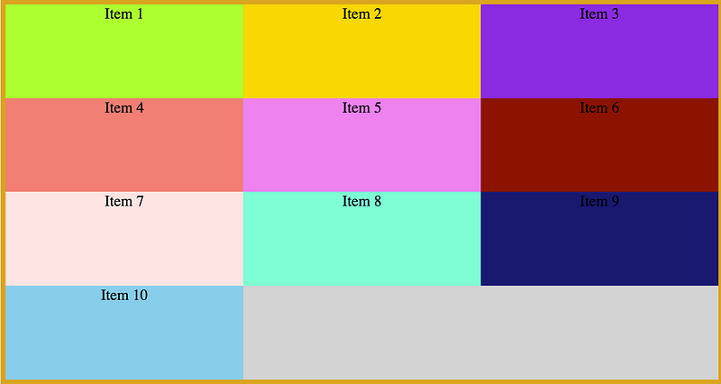
Let us observe the changes that will result from the different options.

Now let us try combining the align-content and justify-content properties.
In summary, we have looked at the following flexbox properties:
display: flex | inline-flex;flex-direction: row | row-reverse | column | column-reverse;flex-wrap: nowrap | wrap | wrap-reverse;flex-flow: <‘flex-direction’> || <‘flex-wrap’>justify-content: flex-start | flex-end | center | space-between | space-around;align-items: flex-start | flex-end | center | baseline | stretch;align-content: flex-start | flex-end | center | space-between | space-around | stretch;Other Flexbox properties
The flexbox properties that we have seen here are applied to the flex container. However, the following properties are applied to flex-items;
order: <integer>;flex-grow: <number>; /** default is 0 **/flex-shrink: <number>; /** default is 1 **/flex-basis: <length> | auto; /** default is auto **/flex: none | [ <'flex-grow'> <'flex-shrink'>? || <'flex-basis'> ]align-self: auto | flex-start | flex-end | center | baseline | stretch;Flexbox vs CSS Grid
CSS Grid is another interesting web layout technology. It is recommended that you read about it. Unlike like Flexbox, Grid is two dimensional.
You can learn about Grid here; CSS Grid and here Scrimba Free CSS Grid course
There are several differences and some similarities between these technologies that will be good for you to find out.
Flexbox Resources
Conclusion
The only way to understand these flexbox properties is through practice. Find your favorite website and try to clone the homepage using flexbox. We have gone through most of the Flexbox properties. You should be comfortable with Flexbox, and be able to come up with beautiful page layouts.

